Design
PORTFOLIO

OVER A DECADE OF DESIGN.
A SMALL SELECTION OF WORK.
GoldPear has been designing for South African and international businesses since 2015. The portfolio below spans brand identity, packaging, graphic design, and web development across fintech, food and beverage, healthcare, professional services, architecture, hospitality, and retail. Every project responds to a specific brief, with a clear purpose and considered creative direction.
CUSTOM BRAND IDENTITIES
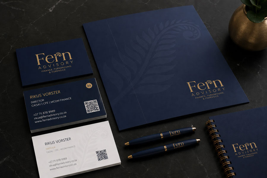
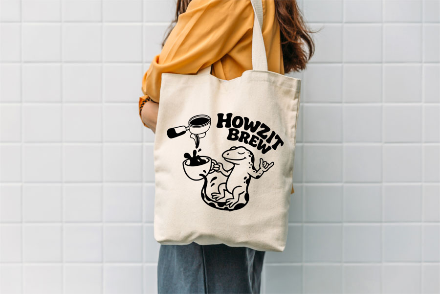
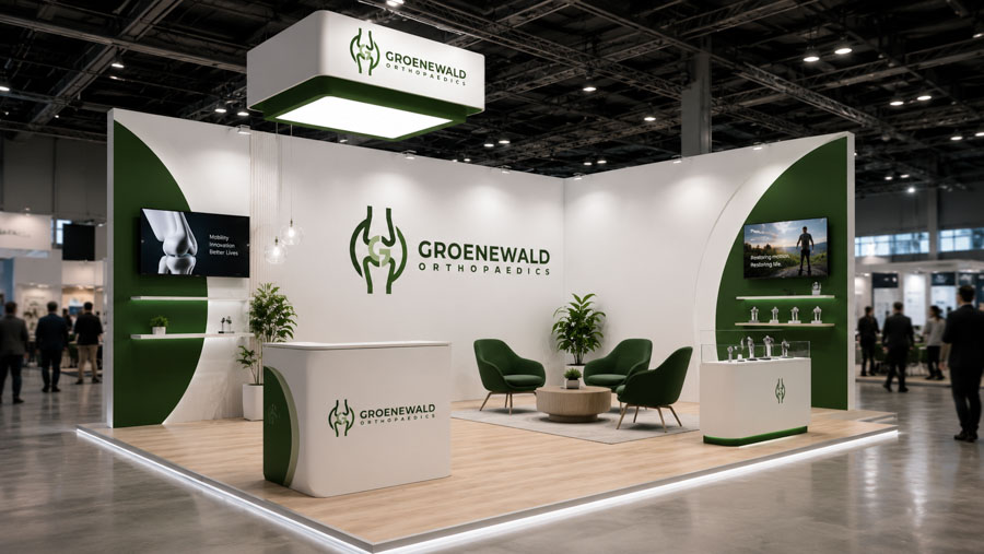
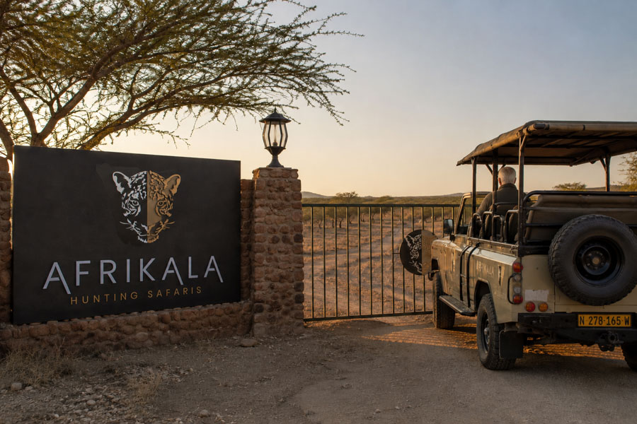
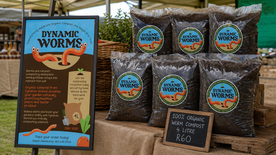
With over a decade of practice, GoldPear has designed hundreds of custom logos and brand systems across nearly every industry category. Each identity is original – developed from a blank page, not a template library.
Clients receive the agreed logo variations, file formats and usage guidance for consistent application across print and digital.


BEFORE & AFTER BRAND REFRESH
A brand refresh is not a cosmetic exercise – it is a strategic decision about how a business wants to be perceived moving forward. The examples below demonstrate how clarity, scalability, typography refinement, and stronger visual systems can modernise a business while maintaining recognition.
Drag the cursor to reveal the transformation.


SELECTED WORK
The projects below represent longer-term partnerships and more complex creative engagements. Each one tells a different kind of story about how design thinking, brand strategy, and craft come together to produce something that actually works.
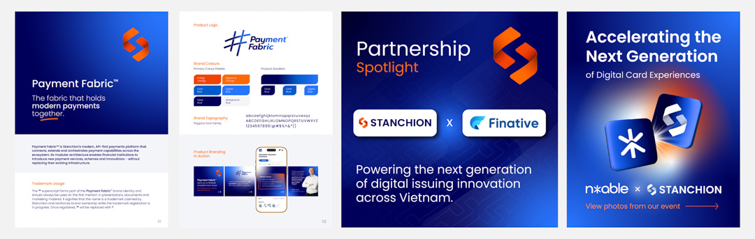
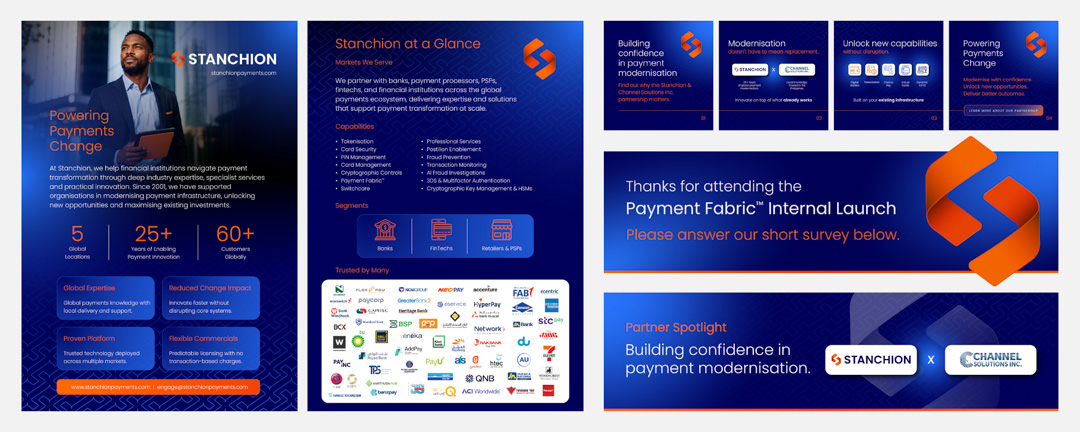
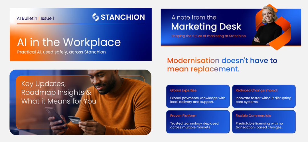
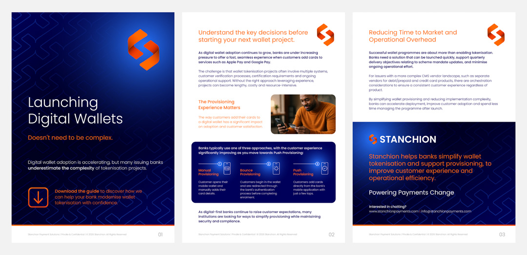
STANCHION | Global Payments
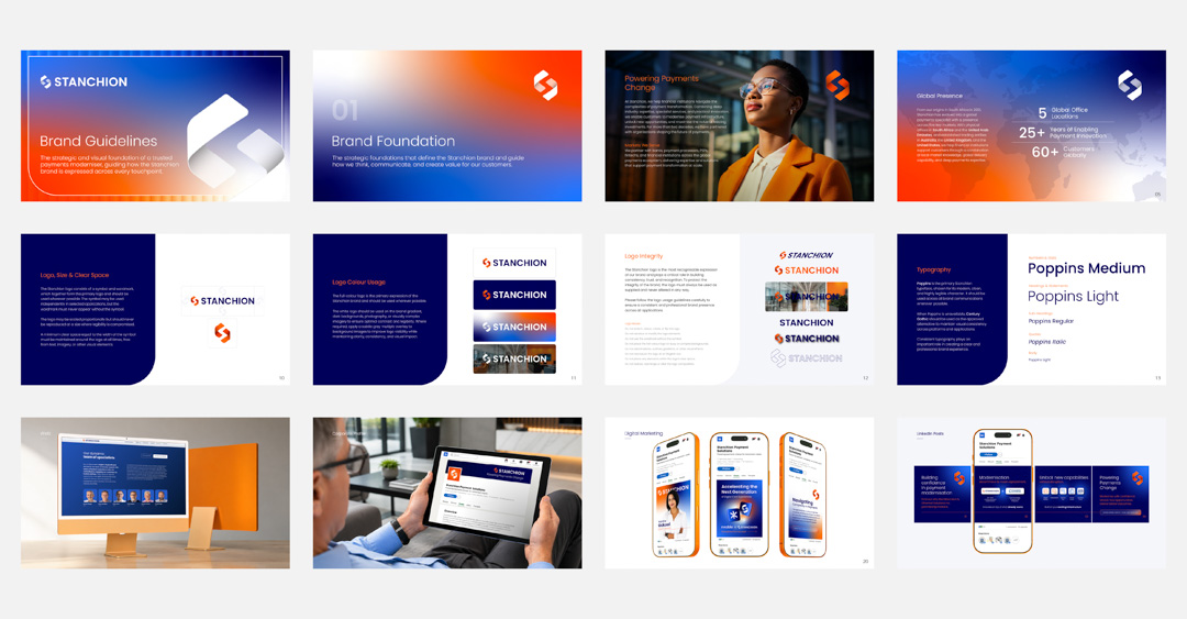
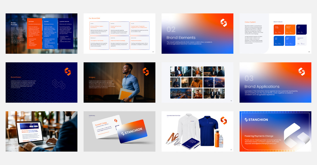
GoldPear refreshed Stanchion’s visual identity around a clear brand idea: Powering Payments Change.
The work brought colour, typography and supporting graphics into a cohesive system, with practical guidelines for consistent use across the business. The refreshed identity continues to take shape through corporate presentations, digital campaigns, event collateral and branded merchandise, supported by reusable templates and ongoing creative direction.
Scope of Work
- Visual identity refresh and brand guidelines
- Presentation design and PowerPoint templates
- Digital campaign assets and email banners
- Event and marketing collateral
- Branded merchandise design
- Ongoing brand rollout and design support
SCAN TO PAY | JOHANNESBURG
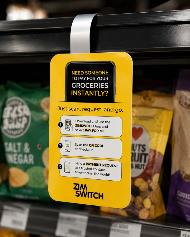
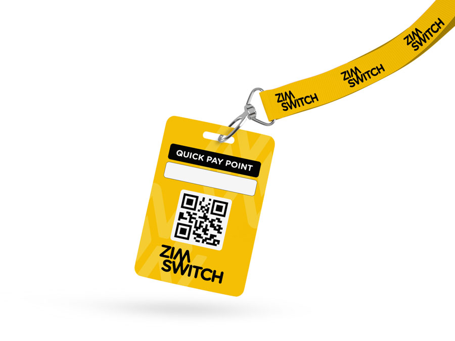
Scan to Pay is South Africa’s largest QR payment ecosystem, operating at national scale within the fintech and digital payments industry. GoldPear partnered with Scan to Pay during a pivotal period of brand transition and growth, playing a central role in establishing the platform as a credible, standalone fintech brand with a distinctive market presence.
As a strategic creative partner, GoldPear led the visual direction, brand evolution, and design systems across digital, print, and in-store channels. Working closely with a fast-paced internal marketing team, GoldPear helped shape brand positioning, visual language, and user experience, ensuring the brand was consistent, clear, and engaging for both B2B partners and B2C audiences at every touchpoint.
Scope of Work
- Brand identity development and visual direction
- Strategic rebrand and design system evolution
- Website design and development
- Digital advertising campaigns
- Social media branding and content templates
- In-store and merchant collateral
- Educational how-to guides using custom illustration
- Brand guidelines and visual governance across multiple designers


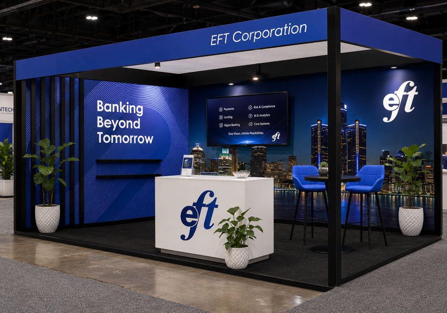
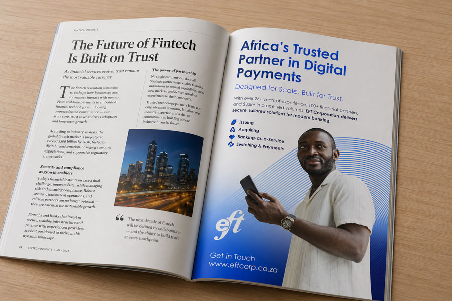
EFT CORPORATION | UK & SA
GoldPear served as a retained design partner, working seamlessly alongside EFT Corporation’s internal marketing team as an extension of the business. Focused on visual clarity, hierarchy, and consistency, GoldPear ensured complex fintech products were communicated clearly without sacrificing a polished, enterprise-grade aesthetic. By developing scalable design systems and reusable templates, GoldPear enabled faster execution across multiple touchpoints while maintaining strict brand integrity.
Scope of Work
- Kiosk and payment terminal layouts
- Strategic corporate and investor presentations
- Digital and print advertising campaigns
- Internal communications and staff-facing materials
- Corporate branded collateral and templates
- Brand guidelines and visual governance across multiple designers


FLAT LIZARD COFFEE | SEDGEFIELD
A distinctive, illustration-led visual style was developed to help Flat Lizard stand out in a competitive coffee market. Bold colour, custom artwork, and confident typography create strong shelf impact and appeal directly to coffee enthusiasts.
The branding is playful and engaging across packaging, signage, takeaway cups, and merchandise. GoldPear continues to manage and evolve the brand as the business grows, while maintaining a clear and consistent core identity.
Scope of Work
- Brand development and visual identity refinement
- Coffee packaging design
- Custom illustration and artwork
- Shopfront signage and in-store branding
- Takeaway cups and printed collateral
- Advertising campaigns
- Digital marketing assets


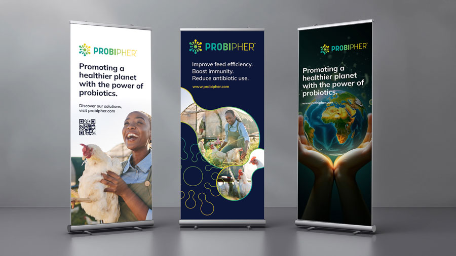
GRAPHIC DESIGN & MARKETING COLLATERAL
Professional design systems developed for internal communication, presentations, campaigns, investor material, and brand consistency across organisations.


WEB DESIGN & DEVELOPMENT


MORE FROM THE STUDIO
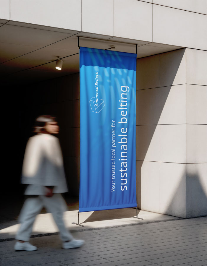
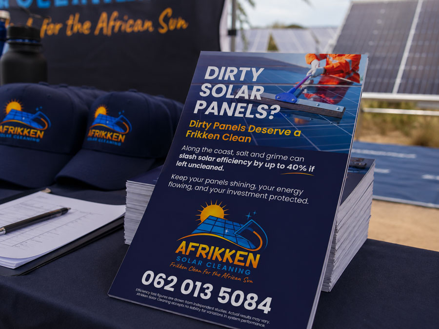
A selection of packaging, campaigns, print and digital design created by GoldPear.